In the realm of web design and WordPress customization, creating a seamless and user-friendly experience often involves tweaking various elements, including menu items. Sometimes, you may need to hide certain menu items on either desktop or mobile devices to optimize the display and functionality of your website. Whether it's simplifying navigation or tailoring content for different screen sizes, knowing how to hide menu items in WordPress can be a valuable skill. In this guide, we'll explore different methods to achieve this task effectively.
Understanding the Importance of Menu Customization#
Before delving into the technical aspects, it's crucial to understand why customizing menus is essential. A well-organized and clutter-free menu enhances user experience by making navigation intuitive and efficient. By hiding specific menu items based on device types, you can prioritize content, streamline navigation, and ensure that your website looks polished across different platforms.
Using CSS to Hide Menu Items#
One of the most common methods to hide menu items in WordPress is by utilizing Cascading Style Sheets (CSS). CSS allows you to apply styles and visual changes to elements on your website, including menus. Here's how you can hide menu items using CSS:
1. Navigate to your WordPress dashboard and go to Appearance > Customize > Additional CSS. Here, you can add custom CSS code to target and hide the desired menu item(s).
/* Hide menu item on desktop */
@media only screen and (min-width: 981px) {
    .hide-menu-item-on-desktop {
        display: none !important;
    }
}

/* Hide menu item on mobile */
@media only screen and (max-width: 980px) {
    .hide-menu-item-on-mobile {
        display: none !important;
    }
}
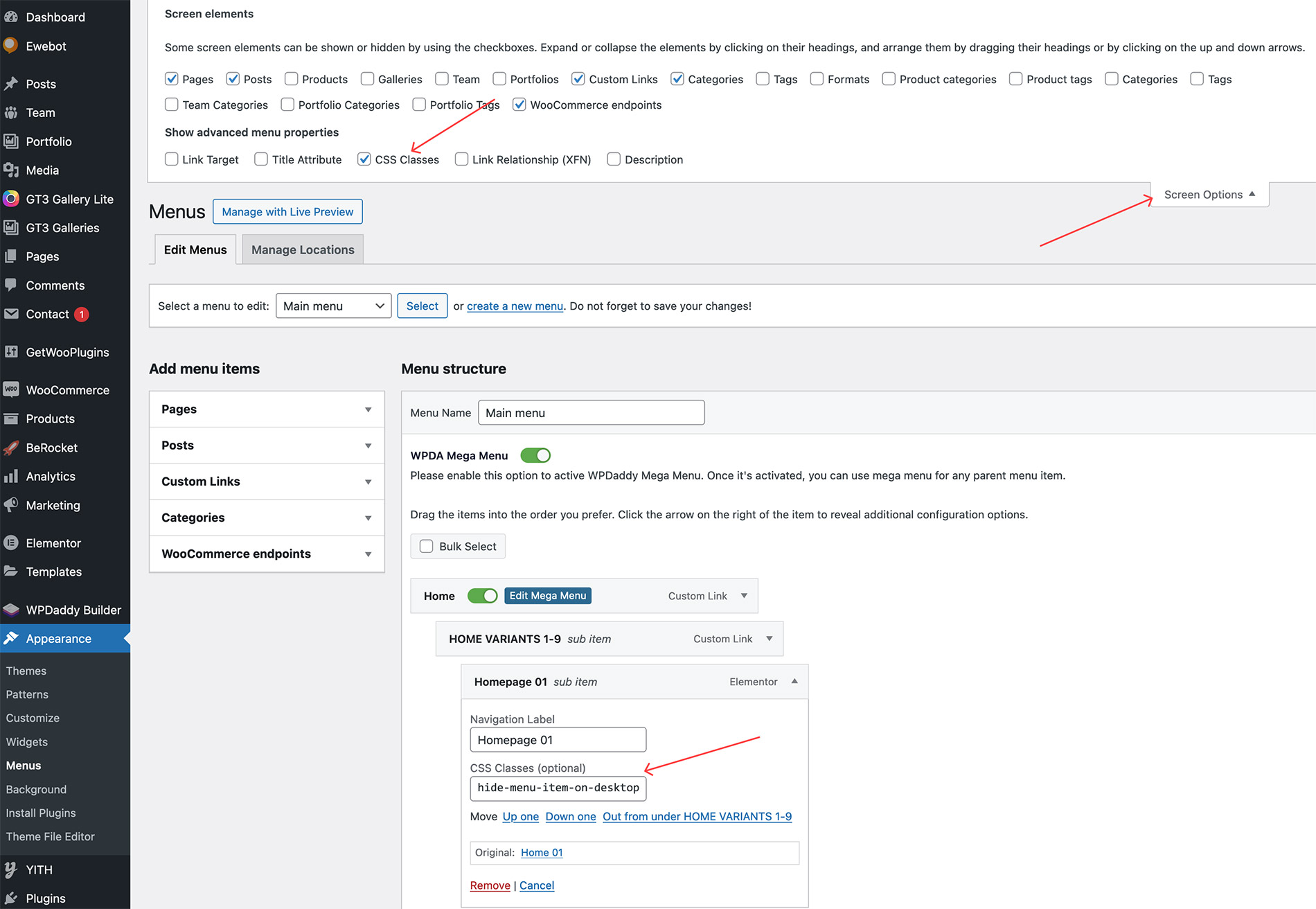
2. Once custom CSS code has been added, please navigate to Appearance -> Menus and add the created custom CSS class to the menu item that you want to hide on desktop or mobile.
Best Practices for Menu Optimization#
When hiding menu items in WordPress, it's important to follow best practices to ensure a seamless user experience:
- Prioritize Content: Hide less relevant or secondary menu items on mobile devices to prioritize essential content and improve usability on smaller screens.
- Test Responsiveness: Always test your website's menus across various devices and screen sizes to ensure that hidden items are correctly displayed or accessible when needed.
- Accessibility Considerations: Ensure that any hidden menu items are still accessible to users who rely on assistive technologies like screen readers.
- Regular Updates: Keep your menus updated and optimized based on user feedback, analytics data, and evolving design trends.
By mastering the art of hiding menu items in WordPress, you can create a more user-centric and visually appealing website that adapts seamlessly to different browsing environments. Whether you opt for CSS tweaks or leverage plugins for advanced menu control, the key lies in maintaining a balance between functionality, aesthetics, and usability. Start experimenting with these techniques today to elevate your WordPress site's navigation experience!