Example - Agno Creative Portfolio WordPress Theme
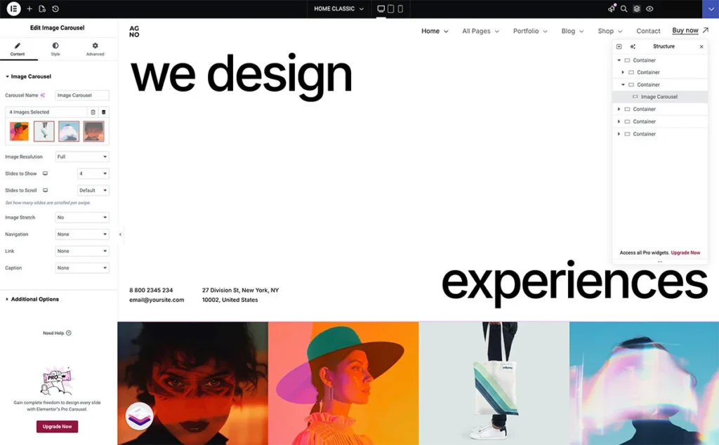
You want a section that fills the entire browser window - no more, no less. Inside it sits an image carousel that stretches or shrinks with the viewport. This guide covers both techniques: setting up a proper 100vh container and making elements inside it scale proportionally with the screen.
Part 1: Viewport Height (100vh) in Containers#
What 100vh Actually Means
100vh equals 100% of the browser's visible area. A container set to 100vh fills exactly one screen - regardless of resolution. On a 1080p monitor it's 1080px tall. On a 1440p monitor it's 1440px tall. The content adapts, the section always fits.
Setting Up the Container
Open your container's Layout settings. Under Min Height, type 100vh. This tells Elementor: make this container at least as tall as the viewport.
Why min-height and not a fixed height? Fixed height clips content if the viewport shrinks below what's needed. Min-height guarantees the full-screen effect on large screens while letting the container grow on smaller ones where content needs more room.
The Mobile Toolbar Problem
100vh on mobile has a well-known issue: mobile browsers have a collapsing URL bar. When the bar is visible, 100vh is taller than the actual visible area. The page jumps when the bar collapses.
Elementor handles this through its responsive controls. Switch to the mobile breakpoint in the editor and adjust the min-height separately. Two options work well here:
Option A - Use a slightly smaller value like 90vh for mobile. This accounts for the browser chrome and prevents the jump.
Option B - Use a fixed pixel value for mobile. If your design needs a specific mobile height, set it explicitly. Go to Advanced > Responsive and override the min-height per breakpoint.
Content Alignment Inside 100vh Containers
A 100vh container often has content that doesn't fill the entire height. You need to control where elements sit within that space.
In the container's Layout tab, set Justify Content to control vertical placement: flex-start pushes everything to the top, center puts it in the middle, space-between distributes elements evenly. For a hero section with a heading at the top and a carousel at the bottom, space-between is the natural choice.
Align Items controls the horizontal axis. Set it to stretch if you want child elements to span the full width.
Nesting Containers for Complex Layouts
A single 100vh container rarely holds everything directly. The typical structure looks like this:
- Outer container: 100vh, direction column, justify-content space-between
- Top container: holds the header/navigation area
- Middle container: flex-grow 1, holds the main content area
- Bottom container: holds the carousel or footer elements
The middle container gets Flex Grow: 1 in its Advanced settings. This tells it to absorb all remaining vertical space after the top and bottom containers take what they need. The result: your carousel stays pinned to the bottom, your heading stays at the top, and the middle section fills whatever space is left.
Part 2: Making Images Scale with the Viewport#
The Core Concept
Images inside a 100vh container need to respond to two things: the container's changing height and the viewport's changing width. A fixed-size image breaks the layout as soon as the browser window changes. You need images that scale proportionally.
Image Widget Sizing
Select your image widget. In the Content tab, set Width to 100%. This makes the image fill its parent container's width. The height adjusts proportionally by default - Elementor preserves the aspect ratio.
If you need the image to scale based on viewport dimensions rather than its parent container, use viewport units. In the image widget's Width field, switch from % to vw (viewport width). A value of 25vw means the image always takes 25% of the screen width, regardless of the parent container's size.
For height-based scaling, set a custom Max Height using vh units. An image with max-height 30vh never exceeds 30% of the viewport height - useful for images inside a 100vh container where vertical space is the constraint.
Carousel-Specific Scaling
Image carousels inside 100vh containers need special attention. The carousel itself should fill the available width, and its images should scale proportionally within it.
Step 1 - Set the carousel's parent container width to 100%.
Step 2 - In the carousel widget settings, set the Image Size to full or large. Avoid thumbnail - it creates a fixed small size that won't scale.
Step 3 - Control the slide dimensions. If using Elementor's Image Carousel widget, go to Style > Image and set the image width/height. Use percentage values to keep things fluid.
Step 4 - For the carousel container itself, set a height in vh units. If your 100vh section has a heading taking roughly 30vh, set the carousel container to approximately 40-50vh. This gives consistent proportions across screen sizes.
Object Fit for Image Containers
When images scale, they sometimes distort or leave gaps. The Object Fit property controls how images behave inside their containers.
In the image widget's Style tab, find Object Fit:
- Cover - the image fills the entire container, cropping edges if needed. Best for carousels where you want edge-to-edge images without gaps.
- Contain - the full image is visible, but may leave empty space. Good when the entire image must be seen.
- Fill - stretches the image to fit, ignoring aspect ratio. Almost never what you want.
For a carousel at the bottom of a 100vh section, Cover is usually the right choice. It ensures images fill their slots cleanly at any resolution.
Responsive Overrides per Breakpoint
Elementor lets you set different values for desktop, tablet, and mobile. Use this aggressively for image scaling inside 100vh containers.
On desktop, your carousel images might work at 25vw width. On tablet, bump that to 33vw. On mobile, go to 100vw for a single full-width slide. Toggle between breakpoints in the editor's responsive mode and adjust each value independently.
The same applies to container heights. Your 100vh desktop section might become auto on mobile, letting the content determine the height naturally instead of forcing a full-screen layout on a narrow device.
Putting It All Together
Here's the complete setup for a 100vh hero section with a scaling image carousel (like the AGNO theme example):
Outer container - Min-height: 100vh. Direction: column. Justify content: space-between. Width: 100%.
Top area - Contains navigation and headline. No fixed height - it takes only what it needs.
Spacer/middle area - Flex grow: 1. Absorbs remaining space.
Carousel container - Width: 100%. Height set in vh units (e.g., 40vh). Overflow: hidden.
Carousel images - Size: full. Object fit: cover. Width scales with the carousel container.
Responsive overrides - On tablet: reduce carousel height to 30vh. On mobile: switch outer container from 100vh to auto, carousel to a fixed pixel height or auto.
Common Pitfalls
Content overflow - If content inside a 100vh container exceeds the viewport, the section either clips (with overflow hidden) or breaks the full-screen effect (without it). Test with real content at different resolutions. Use min-height, not height, to let the container grow when needed.
Image loading shifts - Images without defined dimensions cause layout shifts as they load. Always specify width and height attributes, or set aspect ratios on the container to reserve space.
Zoom and browser scaling - 100vh responds to the viewport, not the page zoom level. Users who zoom in see less content in the viewport. Test at 125% and 150% zoom to catch issues.
Retina displays - A container is 100vh on both a standard and retina display, but the pixel density differs. Use high-resolution images (2x) to avoid blurriness on retina screens, especially for carousel images that scale up on large monitors.